How the MTA got 99% of New Yorkers to agree


Date: 2021/06/03
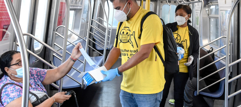
New York City’s subways and busses will soon deliver us once again to the restaurants, bars, Broadway shows, and concert halls we have missed so much for the past year, but the ride is sure to look a little different. Nearly 99% of public transit riders are wearing masks (source).
Getting 99% of New Yorkers to agree on anything is an incredible feat, especially considering that just over a year ago the vast majority of New Yorkers didn’t even own a mask.
To understand how Joe and his team, who used to spend most of their time thinking about ridership, suddenly find themselves using design to make a difference in the public health space, we need to go back to March 2020.
“The MTA had to be there,” Joe tells me. “Parts of the city were closing down, the entirety of Midtown was closed, the offices were closed, but we couldn’t shut down… The MTA exists to keep the city moving, and by virtue of having to show up every single day to this thing, we had to create, iterate, and evolve. We had to tell [our riders] something, we had to keep them safe, and we had to get essential workers where they needed to go.”
As a New Yorker, I remember those early days clearly… and I specifically remember being scared and confused, almost paralyzed, by all of the conflicting messaging…

Joe and his team understood that to keep New York safe, and keep essential workers moving, they had to change the city’s behavior. But first, they had to capture the city’s attention!
So, they set about dreaming up the Safe Travels Campaign and developing a visual identity system that could deliver on just that… “We had to create something that could cut through the noise of the city…” Joe explains, “but we didn’t have to meet fear with fear.”
Joe and his team, decided to make a bold move: they pivoted away from the look and feel expected from a public health campaign — serious, somber, with colorways that could signal fear and ‘warning’!— and opted instead for playfulness, levity, even a bit of New York grit.
“I think we went a lot further in terms of style and tone than many of our peers did,” Joe says. “I have to share credit with those above me who were open to a broader palette of messages, moods, and tones, than you might have expected from a transit agency…. they have a great sense of messaging and of play.”

From the beginning, Joe and his team knew that consistency and repetition would be key in creating, and reinforcing behavior change. Consistency, over time, establishes relevancy, builds credibility, and demonstrates trustworthiness. Repetitive exposure to the same messaging normalizes change; builds memory structures; and opens up mental availability for a given message.
By developing a strong visual identity system, Joe and his team were able to roll out iconic pieces of graphic design across multiple visual touch-points.
Every piece of design looks and feels like it belongs to the campaign. Yellow+black colorways, pared back graphic design style, and an accessible visual tone have come to implicitly signal ‘wear a mask & socially distance’. Riders see collateral from the campaign, and implicitly know that it’s a reminder to mask-up. This further reinforces behavior without needing to speak a word… and it’s everywhere!
As Joe explains, “it kind of grew organically… it’s a multi-channel campaign that now includes floor decals, station signage, a digital signage network… Plus, it is on our social media, it encompasses strong press outreach, partnerships with local media, and a monthly volunteer corps of people who sign up to (wear branded shirts and) give out masks.”

Design truly has the ability to spark behavior change, “I believe in it, otherwise I wouldn’t be doing it,” Joe says.
Visual identity systems are powerful tools establishing relevancy, building credibility, and normalizing change. Design has the power to communicate powerful messages without needing to speak a word.
When asked how the MTA was so effective, even in the midst of a rapidly changing situation, Joe told me, “we were flexible, but stayed true to our guiding principles.” This is a lesson that any organization or brand can learn from— it’s about focus. Having a strategic goal and a clear brief at the core of design is key to effective design work that can endure change.
Joe goes on to explain how it worked for them, “what you say no to is as important as what you say yes to. So, knowing early on what our guiding principles were, gave us a good framework —we wanted to be useful, we didn’t want to be scary, we wanted to be clear and simple— that helped us keep it consistent, even as we expanded into areas we never thought we would go. We never imagined at the beginning of 2020 that we would be creating floor decals!”
“My mantra for my team,” he continues, “is that we do two things: we do story telling, and we do problem solving; and often times, we do both. In everything we create, we aim to be useful, be respectful, and if we can be clever or entertaining, that’s even better! But, above all, we think about the people. We really think about them, and how to meet even the toughest sceptic where they are. We work for the people of New York.”
Joe and his in-house design team were led by Steve Moverley, who created all of the eye-catching illustrations for this campaign. “It’s been a privilege working on something like this and knowing that things I’ve designed may have made someone’s day a little more bright, or a little less scary,” Steve adds. Joe, his creative team, and the entire team of essential public transit workers at the MTA have done an incredible service for our city as the pandemic continues. They’ve contributed, in no small measure, to the ‘new normal’ of New York, and will be there to get us on our way.
In the meantime, they will be there to make us smile. Did you know that there are 12 different mystery footprints hidden around the city? Personally, I know I’ll be wearing a mask, and collecting them all!
The Big Picture


