Flora ProActiv
How can we get our message to cut through?
ProActiv competes in a market where claims (and counter-claims) dominate. It has health benefits and active ingredients that set it apart from competitors, but that message was being drowned out by this sea of claims and counter-claims. Consumers are overwhelmed and ultimately, confused.
The challenge was to re-establish the brand’s point of difference and leadership in this space. Working alongside the design team, the brand developed new positioning territories and designs aimed at reinvigorating the brand.
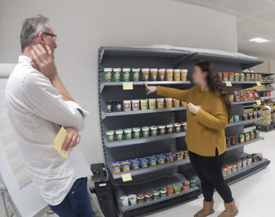
We used 20Twenty, a mixed, behavioural methodology to tap into both the fast and intuitive (System 1) thinking consumers use at shelf, as well as the richness and depth of reflective discussion. Doing this allowed us to understand not only which design had the best cut-through at shelf, but also communicate the active ingredients and cholesterol lowering benefits.
DBA Design Effectiveness Award (Silver)
- In the 7.5 months following relaunch, Flora ProActiv has arrested a steep decline in sales values with an additional 40,000kg of product sold.
- An extra 108,000 UK households are now using Flora ProActiv to lower their cholesterol and reduce their exposure to cardiovascular disease.
- Appeal increased by 33% amongst non-users of Flora ProActiv
- Purchase intent in the top 8% of design tested in Unilever, globally – ever!
20Twenty

Our insight reinvigorated ProActiv’s premium positioning in the market with a design that speaks a language of efficacy, naturalness and science.
By deploying the semiotics of science, the new design heroes its active ingredient and communicates its end product benefit with a visual immediacy that words never could match.